Logos & Icons
Latest about Logos & Icons
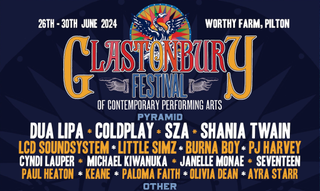
I love that the 2024 Glastonbury Festival logo looks so old
By Joe Foley published
The festival's design remains wonderfully vintage.

The Anaheim Ducks' revived logo is more than just fan service
By Natalie Fear published
Classic design gets a modern makeover.

The new Verizon logo is a glowing success
By Joe Foley published
(Even if it looks like another famous brand).

The new Perkins logo shows how to modernise while staying retro
By Joe Foley published
The rebrand emphasises the restaurant chain's heritage.

The new Croatia Airlines logo looks great... except on planes
By Joe Foley published
And that's kind of a problem.

A’ja Wilson’s Nike logo makes perfect sense
By Natalie Fear published
Fans are criticising the design – I think it's a classic in the making.

This new AI app's logo has a clever hidden meaning
By Joe Foley published
It perfectly encapsulates Dot's aim.
The National Football Museum's new logo is brilliantly simple
By Joe Foley published
Goal!
Get the Creative Bloq Newsletter
Daily design news, reviews, how-tos and more, as picked by the editors.

